The tenants: a couple with a girl and twins on the way
Location: Bnei Brak
Apartment size: 75 square meters
At our first meeting, during the planning phase, the couple asked me to design for them a three-room apartment with a rental unit next to it. Not long after they contacted me and happily announced that they were expecting twins. Naturally, these new circumstances forced us to completely change and adapt the initial plan to their new situation. We needed a miracle. We had to turn a small three-room apartment into a four-room apartment that would accommodate five people.
As a designer I knew I was about to face quite a challenge. The 75 square meter apartment was small even for a three-room apartment. Now, using the same space, we had to plan a comfortable and luxurious apartment for a large family that would contain a master suite, a living room, a kitchen, a bathroom and laundry room, and bedroom for a young girl and a room for the new twins. It was clear – I had to somehow find creative solutions to add a sense of spaciousness.
Functionality and Compactness
With the help of the client we started looking for solutions to create more space. We found an area between the toilet and the bathroom that adjoined the living room space and decided to turn it into a kind of a multi-use cube. One side of the cube would serve as a bookcase and a beautiful place to display the family’s silverware collection, the opposite side would be used as a laundry area, and another side would be used as an elegant wall with a little basin for hand washing (Netilat yadaim). The cube saved us. It ended up being an elegantly designed solution that combined both aesthetics and functionality at the same time. This cube also allowed us to create a functional space for the family that, in addition to all the solutions it offered, also became a multipurpose laundry closet with enough space for both a laundry machine and drier and even had room for the family’s suitcases!
A Warm Place in the Heart
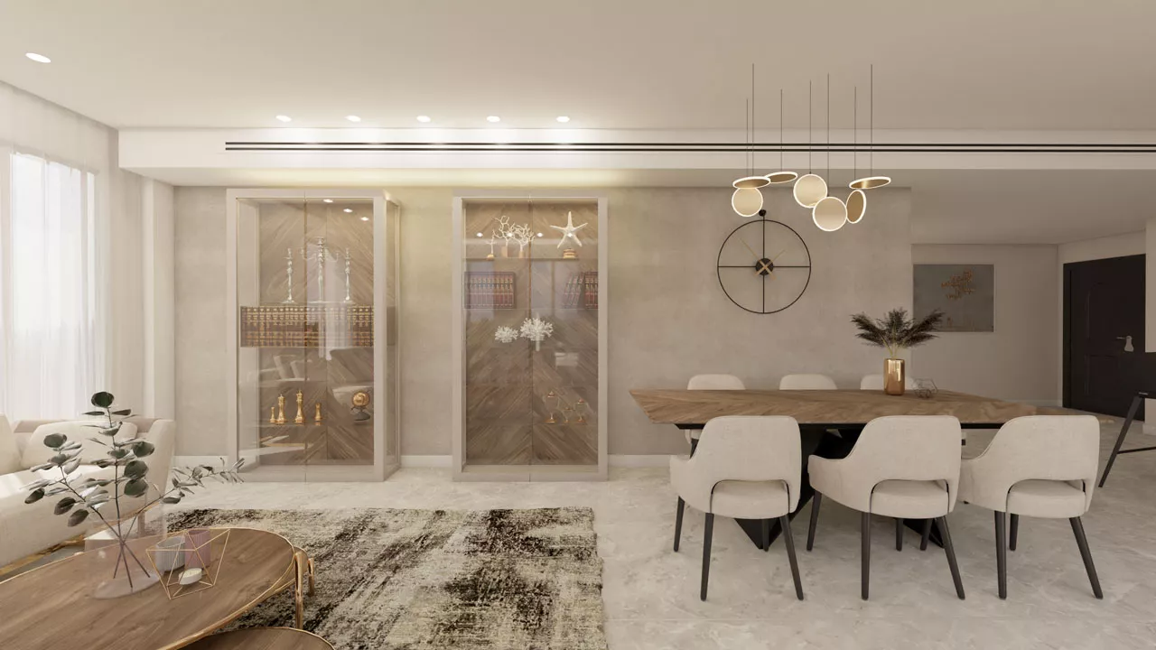
With every project I design, I endeavor to create a special bespoke place for the lady of the house. A small space that warms her heart. In this case, my customer who collects silverware wanted a place to show case her beautiful pieces of silverware. In order to achieve this we did the following:

Firstly, we created an elegant glass display cabinet with clean lines framed in African veneer, which makes the display area look just like a piece of art. We hid the books behind large wooden doors so that the silverware on display would get the most attention. In addition, we installed black glass in the background to create a sharp contrast of depth highlighting the silverware even more. Finally, we integrated soft, gentle lighting facing the silverware and the result was an impressively designed display cabinet.

With this project, we wanted a clean and light design with a young, fresh look. In the wall adjacent to the display cabinet (one of the cube sides) we used the same tiles that were used to cover the floor but cut them in different shapes and sizes to create a wall. We incorporated gold colored profiles between the tiles, added fixed lighting and a faucet in a brushed gold color. Within the basin we added a subtle gold stripe to enhance the luxurious feel of the wall.

Kitchen
The original kitchen was enclosed and separate from the living room. In the new design, we wanted to create an open planned kitchen that would allow the family to see one another and to communicate even while they are busy cooking. We created a seating island using designer dark color bar stools and hanging lighting. The island creates a feeling of spaciousness both in the kitchen and the living room. We turned a supporting column that we could not get rid of from a disadvantage into an advantage. The column became a design piece that divided the kitchen area from the living room also ensuring that the stove and work area could be slightly hidden.
To bring more air and natural light into the space we opened two large windows. Between them, we left some room that allowed us to install a cabinet above the sinks for drying dishes. We created additional storage space for Passover dishes by installing a hidden cabinet behind a pull-out freezer that allows the dishes to be taken out with ease of access. On the outer part of the cabinet, we added shelves for ornaments and plants, including a special place for the water dispenser at the entrance to the kitchen.

As this family is health conscious and likes to grow vegetables, we added open design shelves on which they could place their many plants so as not take up space on the counter. This way the kitchen will remain neat and orderly. As a final touch, we added black lighting that blended in with the bar stools, taps and ovens. The result: a modern spacious kitchen with a clean and light design.
Parents’ unit
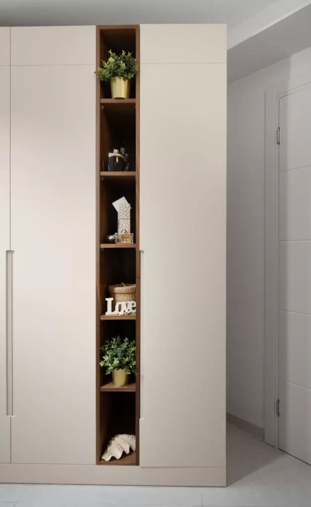
Although the apartment is small, we still wanted to make a master suite for the parents. We came up with a bright design that would give the space a sense of airiness and lightness. The closet in the bedroom is a standard closet with four doors, but because we wanted the parents to have extra breathing space, we left few open niches in the closet for perfumes, plants and beauty care products.

In one of the niches, we added a large and special sea shell that my client received as a gift from her grandmother that is dear to her heart. In the master suite bathroom, to enhance the design and in contrast to our light color palette, we used black faucets and dark aluminum to emphasize the diverse elements in the design and add grace to the space. As the bathroom is very small, we installed the basin outside the bathroom in front of the closet.

The Family Bathroom
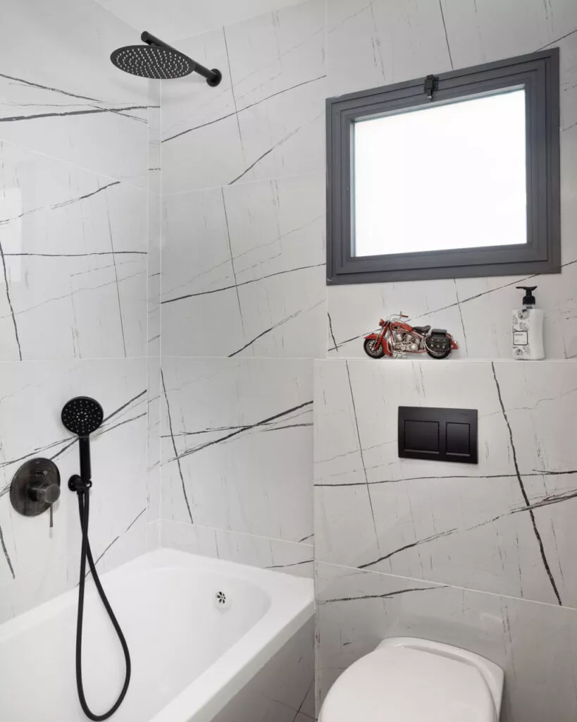
Although the bathroom area was tiny, we chose dark colored tiles. We came to the conclusion that light tiles would not be able to give an aura of spaciousness and therefore decided to use dark colors for a dramatic and luxurious look.
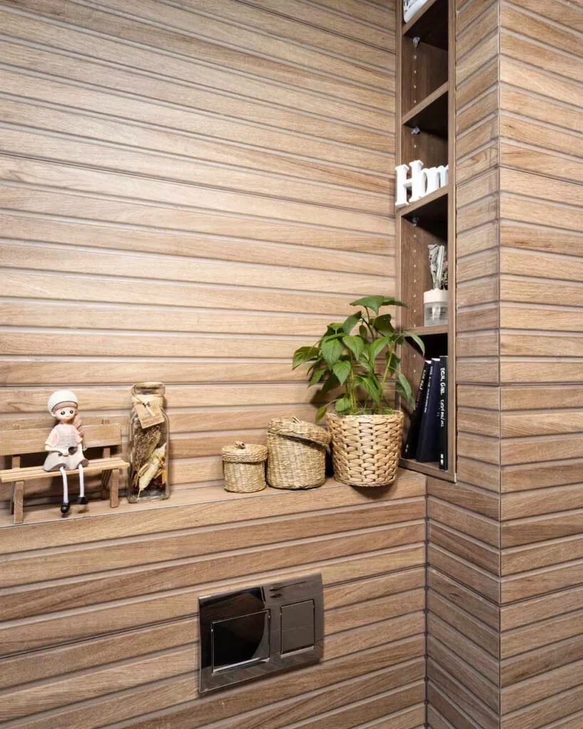
For the walls, we chose an inexpensive tile that looks like real marble and combined it with designed wood-like beams to give warmth. Since we had a structural pillar at the entrance to the bathroom we utilized the space between the pillar and the wall for shelving (in the color of the tiles) on which the family can place books, plants, perfumes and special soaps.

